19 Apr 13
Awesome Uses of Typography in Web Design
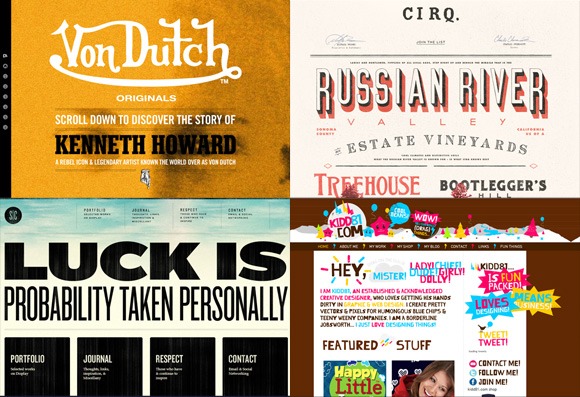 Some say that typography is a 2013 design trend, but typography has always been fundamental to design. For many centuries, styling text has been used to effectively communicate messages. Mastering typography for web design is no doubt a skill that will never become obsolete. There is a fine balance when it comes to web design typography. Since there is an artistic component that can effect the aesthetics of a web page. At the same time when considering typography from the eyes of a graphic designer, text must allow easy reading and comprehension. If the user can’t read the text or if it makes no sense then it arguably defeats the purpose of typography in the first place. With advancements in web technologies, the potential to utilise great typography in web design has increased. Here’s a few awesome examples of typography use in web design.
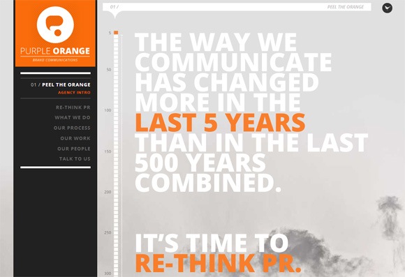
1. Purple Orange
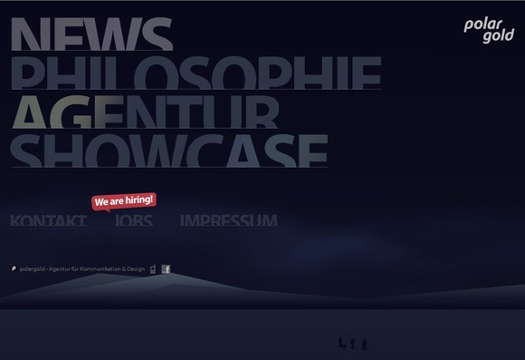
2. Polar Gold
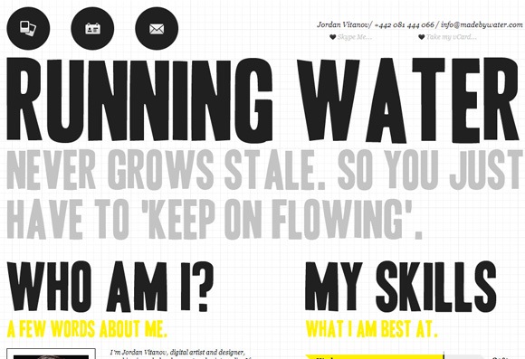
3. Made by Water
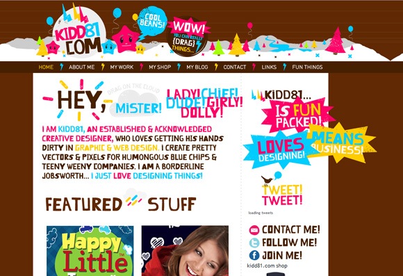
4. Kidd81
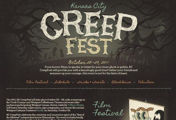
5. Kansas City Creepfest
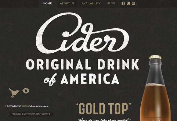
6. Austin Eastciders
7. CIRQ
8.Psych & Psych
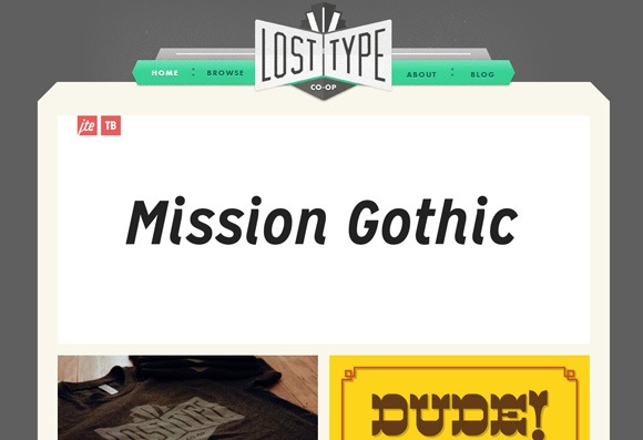
9. Lost Type
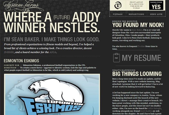
10. Elysium Burns
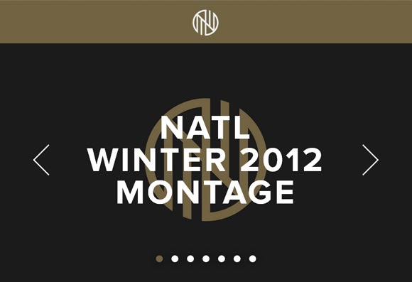
11. NATL
12. Ryan Keiser
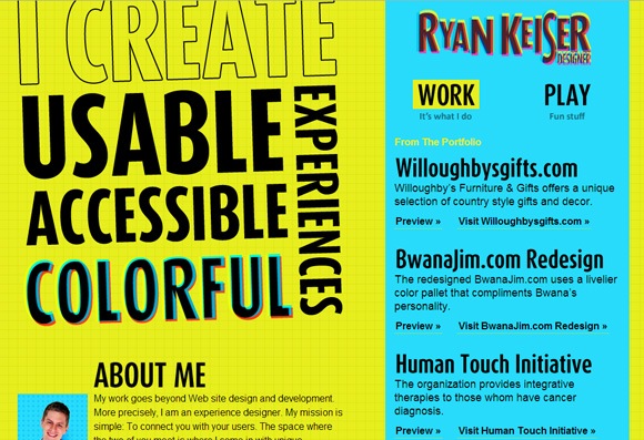
13. Just Dot

14. Earth Hour
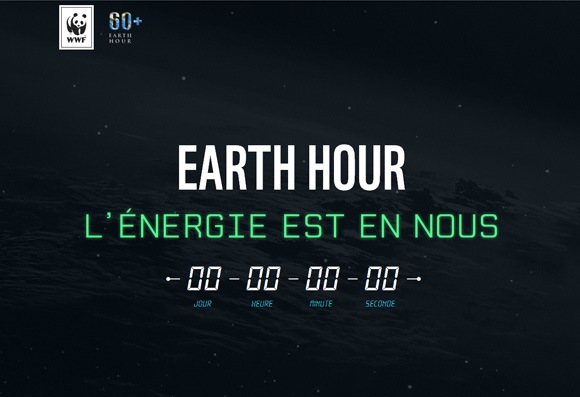
15. Stephen Caver
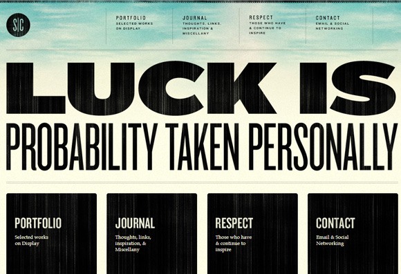
16. Handiemail
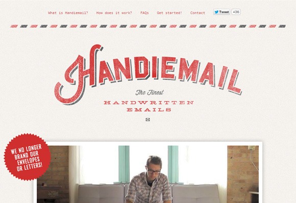
17. Tapmates
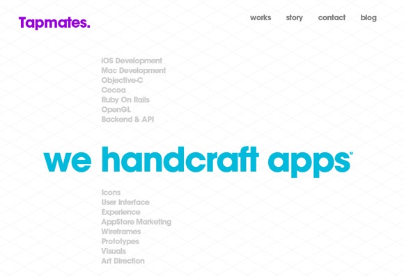
18. La Bubbly
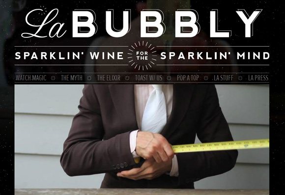
19. Rob Edwards
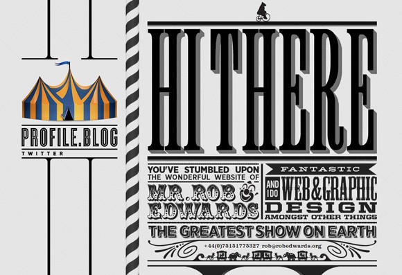
20. Von Dutch
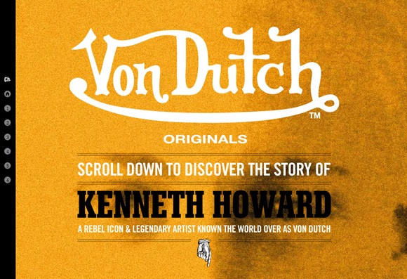
Typography in Web Design
I hope you found some inspiration regarding typography use in web design. Please share your thoughts with us in the comments!
