11 Mar 13
15 Inspirational Australian Websites
 Yes I am a proud Australian hailing from Melbourne. Although our web design and development is probably not as well known as our sporting heroes or our famous wildlife, there are some great Aussie websites that are highly recommended for inspiration and tick the right design boxes. Here are some recent examples, check them out!
1) Love Freo
Don’t be fooled by the .com domain name, this website is all about the unique atmosphere of Fremantle – a beautiful coastal city here down under. Love Freo’s fluidly responsive design is complimented by the simplistic usability that is perfect for its purpose. Its really a challenge trying to flaw this blog styled website. 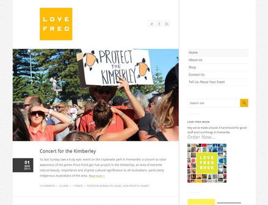
2) Tuan Nguyen Photography
Photography websites are often showcased because of the beautiful imagery and this one is no different, but this site also has some functionally fantastic persistent navigation that works flawlessly with the large front page images. The responsive web design makes the site function very nicely on tablet and mobile devices as well. 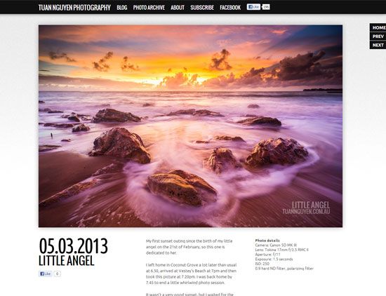
3) Mix Apparel
E-commerce stores are notorious for being cluttered and confusing. Mix Apparel steers clear of flooding the home page with products and instead cleverly uses a large rotating banner to capture its users. Although there is no fancy new technology, the great use of proven design styles and basic website capabilities is surprisingly inspirational. 
4) Ariom
Ariom: Adam Trickett is a smooth fun character and his blog reflects his personality, no question about that. With the recent trend of white and light colours led by the late Steve Jobs and Apple, black themed websites are a rare sight nowadays. The seamless transition between responsive web layouts leads to an enjoyable user experience, which is of utter importance for a personal blog. 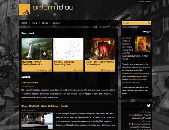
5) Dads Online
This piece of inspiration might be directed specifically at theme and framework designers. This website was built using a premium theme on the Genesis Framework and became a finalist in the 2012 Australian Web Awards. When a theme or templated website stretches the given capabilities to its fullest, it can be a wonderful union to behold. 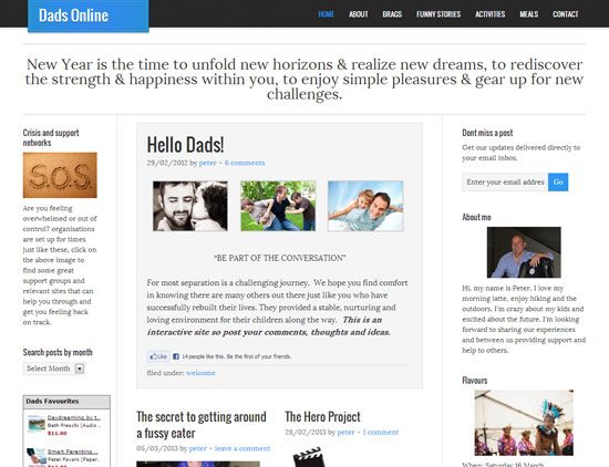
6) The Wheatsheaf Hotel
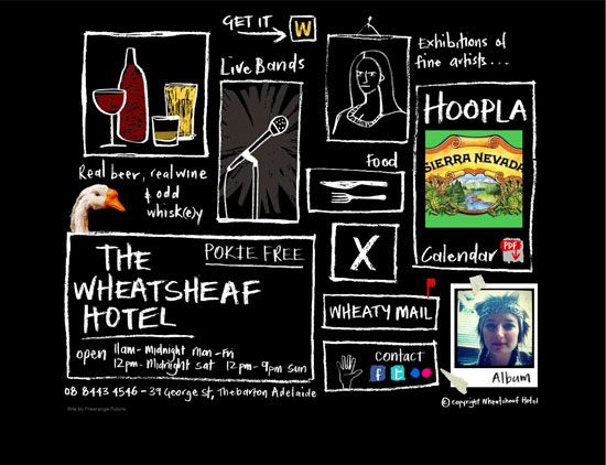
This is the definition of Aussie personality in a website. The no fuss, no worries attitude in combination with a bit of humour and you have The Wheatsheaf Hotel website. The relevance of the blackboard and chalk styling is very smart, whilst making great use of very standard mouse over techniques to achieve fun user interaction.
7) Harley and Soo
Please forgive me this site was developed 2 years ago I believe. Utter simplicity can be easily underrated, I’m sure many designers out there can admire the purposeful sloppiness of this website. From the usage of Courier fonts to the obviously crooked lines, the Harley and Soo website gets away with “designer sins” whilst capturing their target market nicely. 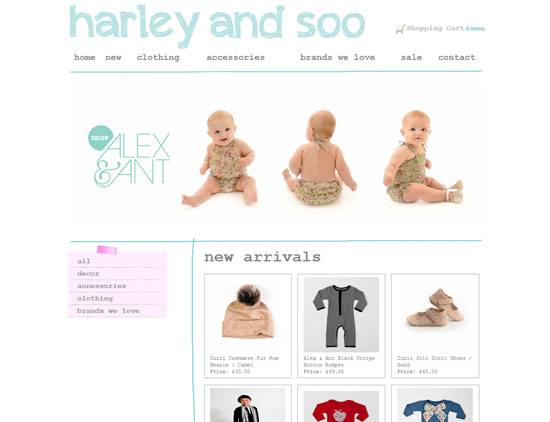
8) Method
A very good example of how great photography and graphic design work can impact a website. Many sites use the “less is more” design philosophy successfully, but it sure helps to have a brand or product images that are vibrant, high quality, professionally shot and processed. The Method website is also lightweight and would score highly in the usability department. 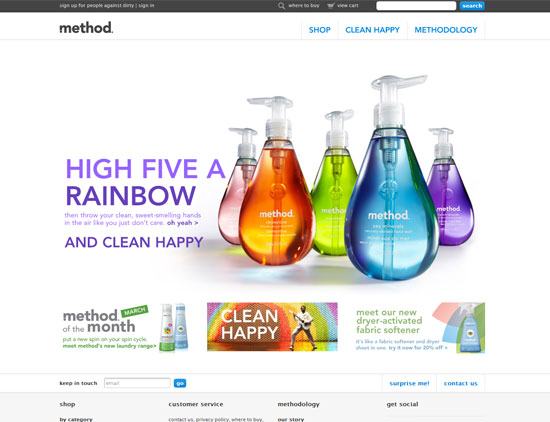
9) Clever Starfish
Despite being another digital agency (in Perth), credit where credit is due. They took a cute and amusing approach as their name suggests, with this highly responsive and well designed website. The subtle animations and consistency with the Clever Starfish branding is highly lovable, the functionality and usability is also flawless across different browsers and devices. If you need digital presence and require a Perth partner I wouldn’t hesitate to recommend these guys. 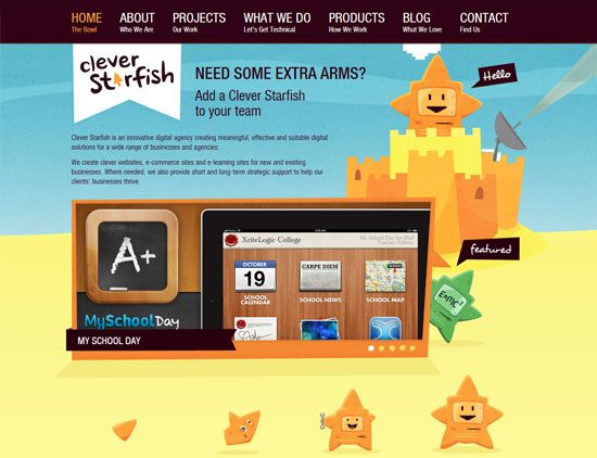
10) JB Hi-Fi Now
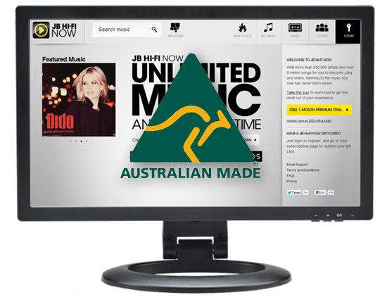
Sure there’s Pandora and there’s Grooveshark that most of us who live online use for music streaming, but it shouldn’t take away from this fantastic piece of technology from JB Hi-Fi Now website. The site is height responsive to ensure the music navigation functionality persists regardless of browser size and the user interface is dead easy to understand. Personally I’m not sure about the product itself, but the website is undeniably sleek. 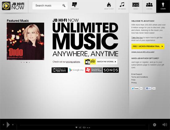
11) Get to know me: Perth
Perth is a unique experience as a city itself and this website embodies that experience. The story telling like navigation along with the stunning photography leads you through a journey in the wonderful capital of Western Australia. The deliberate but fine tuned photo animations are perfect, causing the user to immerse in the Perth atmosphere. The site is highly responsive, but I’d recommend you check this one out on a larger screen or device. 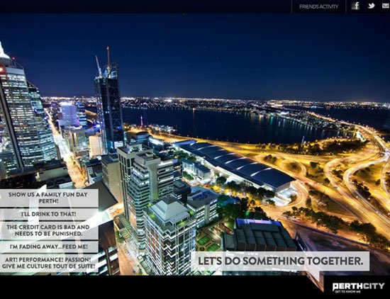
12) Mo’s & Bows
Some of the finest use of appropriate persistent navigation, menu animations and parallax scrolling on this website. This fund raising event website shows creative use of latest design trends doesn’t mean over-doing it. Harmony between branding and web design is a delicate issue at times, but achieved completely here. 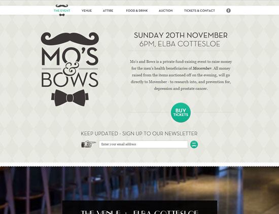
13) Adventure World
The cute vector animations on this site are just adorable, but the playful navigation reflects the nature of Adventure World with such ease that it’s hard not to notice. Every bit of the website interacts with the scrolling navigation, whilst the persistent top menu ensures users are not lost. The single page nature also enhances the user experience, making it a fun trip regardless of the reason for visiting the Adventure World website. 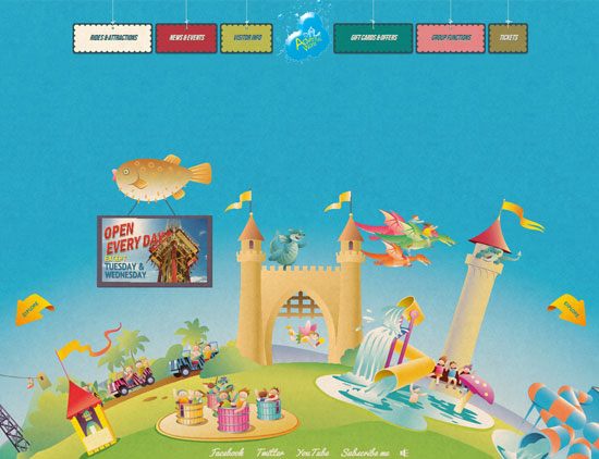
14) People for the Future
A career in mining never looked so attractive, so colourful… ever! Believe it or not this website promotes mining jobs in Australia and does a ridiculously good job at it. It’s rare to see a well designed large accordion style menu, let alone for it to improve usability and functional flow of a website. There are many great uses of mouse-overs and the presentation of content is superb. 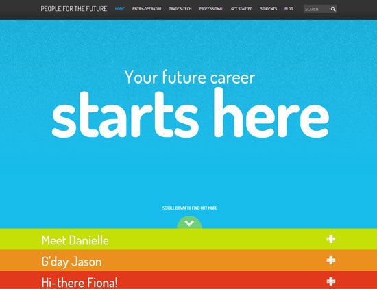
15) Taylor Robinson
A precisely designed architectural, urban design website using parallax scrolling and reactive mouse-hover menu. This style of design places an enormous amount of emphasis on the background images which happen to be very powerful. The site is eye candy and slightly responsive for several screen sizes. 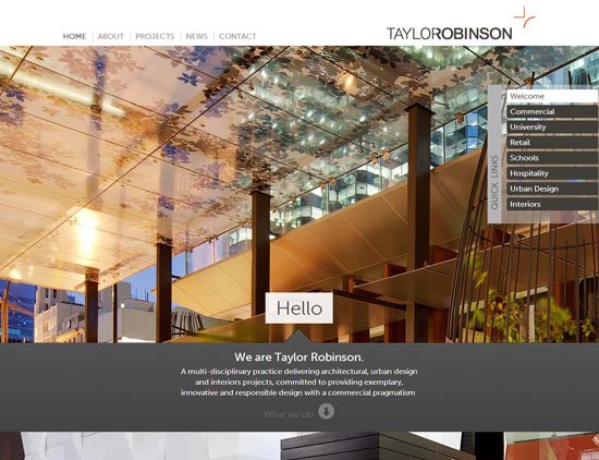
Other Favorites?
There’s obvious talent in Australian web design and development, next time I’ll include more examples from Melbourne I promise. Which ones were your favorites? Any awesome websites that I missed out? Comment below!


