28 May 20
15 WordPress Design Inspirations That’ll Make You Go “Wow!”
Capture and attention are integral to high conversions and engagement for a website. Mastering this is a crucial step towards creating a website that is memorable and stands out to the user, amongst the ocean of average web user journeys that populate the web nowadays.
Our primary focus in this article will be showcasing 15 websites that make a great first impression, taking full charge of the moment users arrive on their digital doorstep. These first 6 seconds are key to determining if the user will sink or swim.
Eye-opening stats that show the importance of capture
- It takes about 50 milliseconds for users to form an opinion about your website that determines whether they like your site, whether they’ll stay or leave
-
38% of people will stop engaging with your website if the content or layout is unattractive
It takes 2.6 seconds for eyes to settle on key areas of a web page - 75% of consumers admit to making judgements on a company’s credibility based on the company’s website design
We’ve looked around the world and selected a few websites that have really wowed us from the get go. Let’s explore them and unpack how you can increase your conversions with professional WordPress designs, ranging across many industries and with different styles.
In no particular order, let’s dive in
1. Liquid nitrogen magic (Ferox)
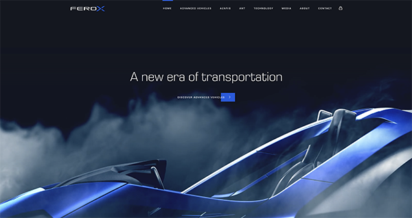
Ever had liquid nitrogen poured over your dessert at a restaurant? I can imagine not only your eyes lit up, but also the eyes from surrounding tables were a little green with envy too, with collective gasps adding to the awe. Ferox captured that moment and distilled it into an everlasting moment; the repeating cinemagraph adds instant class and wonder to their header upon arrival. Genius.
2. Employ cinematic videography (Babordgroup)
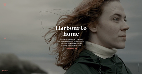
We all have a universal love for the movies, for that movie experience that the next tier of filmography renowned directors bring. But why just save that for the big screen? Babord Group don’t hesitate to pull out all the stops with their truly cinematic header video, undeniably shot with quality art direction and skill. Leave stock videography for the amateurs, make a real first impression with a video that actually hits home.
3. Teleport your users (Autron)
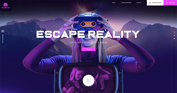
With VR being the talk of the town and the frontier of the gaming world, it was important to us to express this from the moment users hit the site. With futuristic gradients and galactical stars moving like you’re travelling at lightspeed, it feels as if you’ve almost been teleported into a new world…(almost, we’ll leave it to the tech team at Autron to do the rest).
4. Redefine industry stereotypes (Onia)
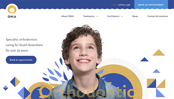
Most people dread going to the dentists. But the dentists at Onia Clinic seem to be of a different breed, judging from their website anyway. Upon arrival to their website, users are welcomed with a wonderfully gentle shot of a smiling boy surrounded with floating golden and blue shapes. Complemented with a curvy navigation bar and pleasing storybook illustrations, it’s almost like the usual fear of dentists has been coaxed away (we’re definitely distracted). Clever.
5. Keep it exciting with animation (Neo)
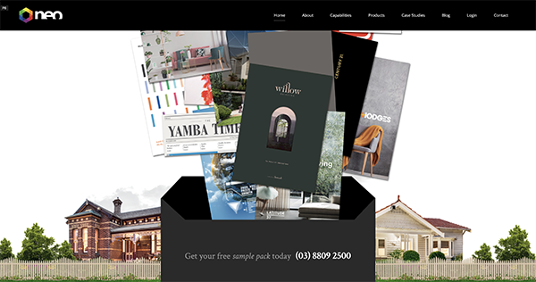
The homepage is key to locking in that good first impression. So if you have anything visual and vibrant to share, don’t hide it away on a subpage which gets less traffic. Serious about good user flow within our conversion framework, we wanted to present the wonder of print with dynamic animation. With multiple arcs of movement spanning the full width of the screen, it’s a wondrous moment that really elevates the user experience, just before they reach the end. Ending the experience on a high, it helps seal the deal of a great first impression.
6. Less is more (Ceremony Coffee)
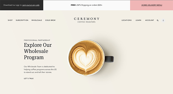
Know the saying less is more? Or the saying, the less you say, the more people will listen? Ceremony coffee lets the pictures speak a thousand words. Paired with a few choice words for a heading and only a couple lines of body copy, the website is very easy on the eyes and the mind. In an age where most businesses are scrambling to say as much as they can (especially with overwhelming chunks of text), it’s extremely refreshing to be met with a more laid back approach. As welcome as a good cup of coffee.
7. Show cuddly animals (The Rookeepers)
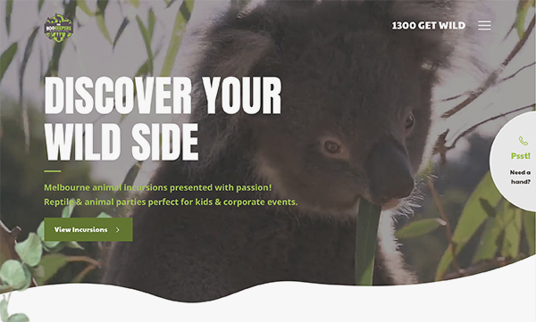
Don’t animals give you the warm and fuzzies? Really, there is minimal effort required for a cat video to go viral! Besides taking a video out of the regular quadrilateral box and adding a couple leaves for an atmospheric touch, we really didn’t have to do much else. We let cinematic videography and the furry protagonists take centre stage to bring the animal excursion experience to life.
8. Get creative with illustrations (Brightscout)
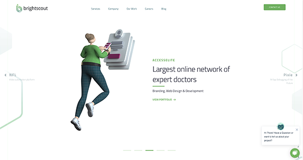
Stuck for words on how to best explain your complex product or service? Don’t limit yourself to textbook definitions. What better solution to express the intangible than the world of illustration? Leave the challenge to artists, who can make the uninteresting, very appealing indeed with their imagination. Brightscout turn their SaaS products into a very engaging web experience with a stunning feature header and matching imagery throughout the homepage.
14. Let classy photography do the talking (Pogg)
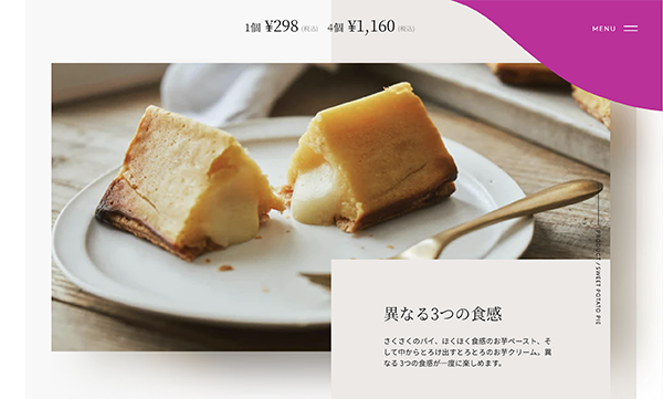
You never would have thought you a sweet potato pie could be presented with such class and elegance, but then Pogg came in with the goods. With stunning assets and a duotone colour palette, POGG makes a very strong visual first impression. Complemented with overlapping text, videography and subtle micro-interactions, this website is literally a feast for the eyes.
10. Use parallax effects to encourage play (Repurpose It)
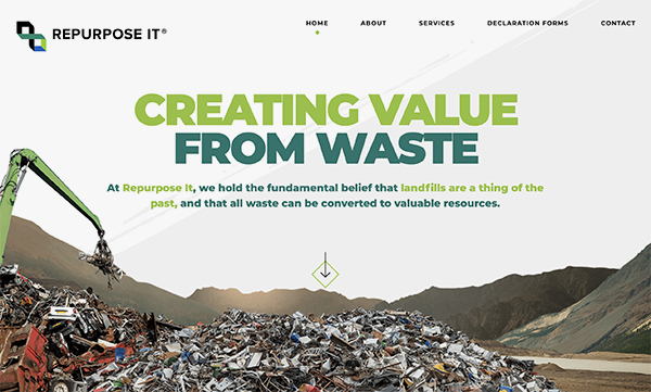
We’ll be honest with you, when initially propositioned with making a site about garbage recycling pretty, we were scratching our heads. With a bit of brainstorming and progressive thinking, we were given the green light to approach creativity with full steam. Parallax effects are one of our favourite tools of the trade to increase user engagement, and bring a header to life. Interactivity drives interactions and encourages users to scroll down. No one wants to play with smelly rubbish, but virtual rubbish that floats? Now that’s a different story.
11. Master the art of storytelling (Rappipay)
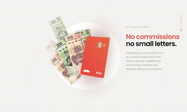
Want to make a truly memorable first impression? Bring the magic of storytelling into the adult space. Rappipay executes the art of storytelling beautifully in a guided user-experience on its homepage, through a linear scroll with its credit card as the protagonist. The story is further brought to life with subtle but effective animations and a minimalistic colour palette. Guide your users through the door, don’t just leave them at the welcome mat.
12. Be bold for maximum impact (YDL Stone)
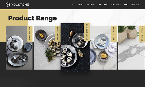
When you’re wholesale retailers of top-tier stone and marble, you let the quality of the stone speak for itself. Professional photoshoot, check. Elegant homewares, check. Bold typography and dark colour blocking for visual contrast, check. The juxtaposition of the light stone imagery on dark blocks really open the eyes up to maximum impact.
13. Think outside the box (Konform)
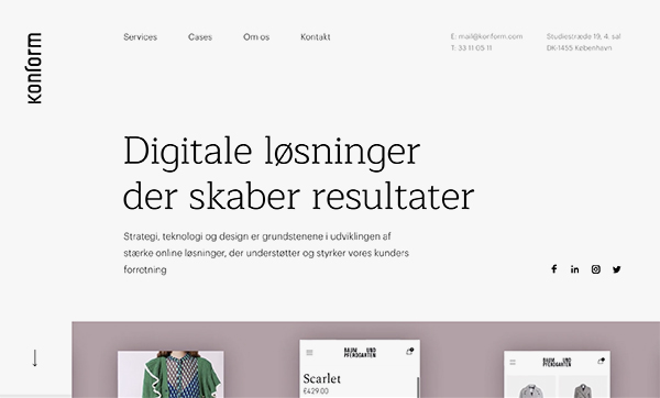
We all know about above the fold, but how to get users to scroll below that? How do you encourage older-generation users who might struggle with digital to keep exploring? Konform show us that we shouldn’t be afraid to experiment, to position things in between. Starting strong with some bold copy and a cut-off video, users are allowed the freedom (and luxury) to focus on one thing at a time, and encouraged to keep scrolling. Sometimes, the solution is not to fit everything into the frame. Think outside the box team.
14. Use a timelapse (Chromatix)
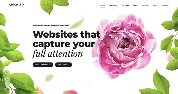
We love to practice what we preach. Now we’re not florists, but we chose to have a timelapse of a peony opening – I mean when was the last time you got to see a flower open in front of your eyes within a few seconds? Almost never, am I right? Bright and memorable is how we want to be seen, tell us did it work for you?
15. Explore texture & patterns (Wildrenfrew)
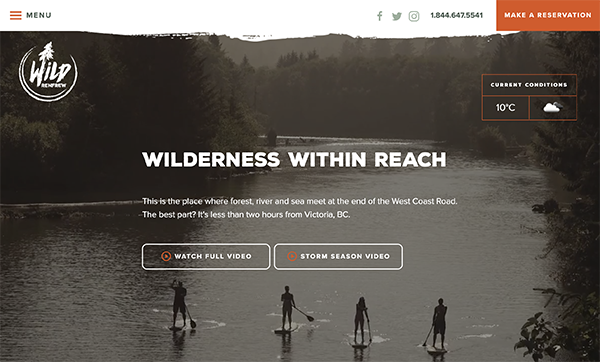
Wanting to elevate the design to the next level without changing too much? You can add a touch of texture and a soft brush stroke to those straight blocks. Wild Renfrew artfully incorporate textures and rough lines to bring in the slight rustic feel of a walk in the wilderness. This gives a layer of depth and personality to the website, for a well-rounded first impression.
That’s a wrap (for now)!
If you liked these ones, stay tuned for Part 2.
If you’d like to use one of these techniques for your own website, you can give us a call at Chromatix on 03 9912 6403 (and be sure to ask for Irwin). With a team of experienced conversion specialists, UI/UX designers, dedicated front-end and back-end developers, we love pushing the limits of WordPress!


