14 Jun 13
20+ Creative Automotive & Car Websites
It’s no surprise that automotive businesses have some of the nicest looking websites. With well known and luxurious brand names hailing from this industry, I’m sure the dollar figures spent to design and develop these visual masterpieces are quite high. The hotel industry might be similar, but we’ve already got a popular post on inspirational hotel websites – be sure to check it out. Most car related websites are “driven” by their stunning product images, but there’s still plenty of inspiration from the content layout, navigation, clever use and manipulation of that awesome imagery. This is NOT a generic list of top automotive brand domains at all. Enjoy our selection of creative automotive & car websites!
Hyundai Veloster
The fancy intro smoothly transitions into a high feature and well crafted parallax scrolling navigation website. The colorize and 360 rotation functions are only the icing on this cake. 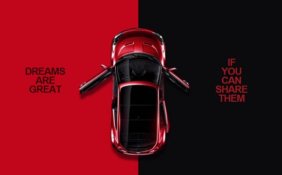
All new Honda CR-V
Not just because its an Australian website. It is genuine, perfect use of persistent menu & call to actions. Very cool use of scrolling navigation as well. 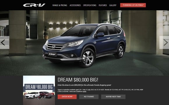
Mercedes-Benz Citan
This French website for Mercedes Citan is simplistic yet powerful. From the dynamic features page, high-res gallery to the dealer location Google map – it’s all minimalistic goodness. 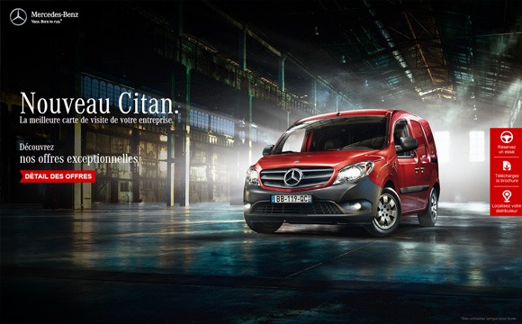
Lexus Europe
Clean, sleek website at its core. Very image and video heavy website, perfect for the European bandwidth. I particularly like the car model drop down menu with toggling options and the subtle animations used in the world of Lexus filter. 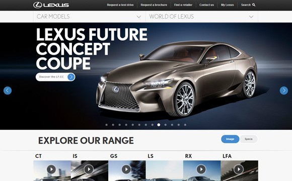
Volkswagen winter campaign 2013
Very nice use of screen space whilst using scrolling navigation and animations. The zooming and panning of the landscape is smooth – great usability. The cute 3d animals are also a nice touch. Clever mouse-over scrolling navigation. 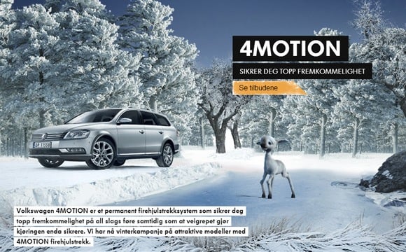
Peugeot – discover new aspects
This Norwegian Peugeot site has great use of HTML5 and an effective, consistent car model menu. Also demonstrates uses of embedded full screen YouTube videos. 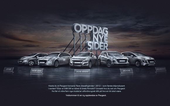
Mazda 6 Malaysia
Clever use of background YouTube videos along with a transparent overlay menu. Nothing super fancy here, just magically light weight and well implemented. 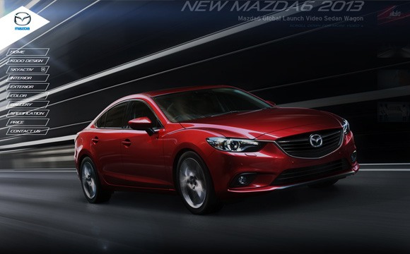
All new Toyota Rav4
Despite being bandwidth-requirement heavy, this Taiwanese Rav4 website is beautifully designed and implemented with lots of HTML5 & CSS3 techonology. 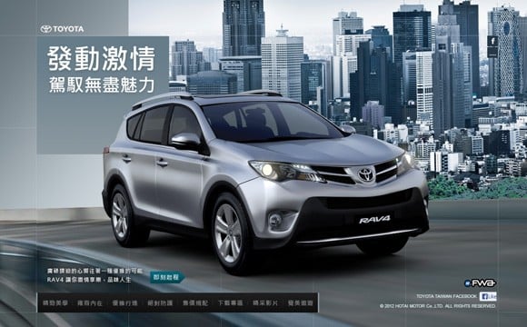
McLaren
Surprisingly many luxury car brands do NOT have cutting edge websites. McLaren was the one that stood out of the crowd, this website executes basic web design principles to perfection. 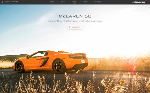
Mitsubishi Australia
Classic design, nothing out of the ordinary. This shows that there is absolutely no harm in sticking to what works, there is still beauty in flawless execution of a basic design. 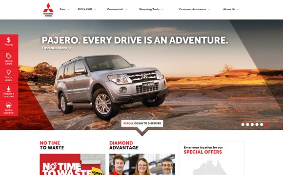
Mercedes Benz Sports Equipment
A perfect example of how web design can transcend languages and cultures. Without being able to read German I can navigate this web page perfectly. The bar dragging functionality is really something, you should definitely try it out. 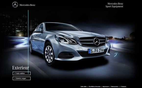
Citroen DS5
Such a suave website. A proportionally perfect blend of car interior and exterior imagery, typography and highly intuitive navigation. 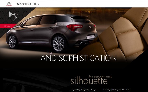
Volvo Cross Country Travels
A very different approach to the usual automotive website by exploring the possible experiences a user might have in this vehicle, instead of the usual blatant showcase of features and technology. 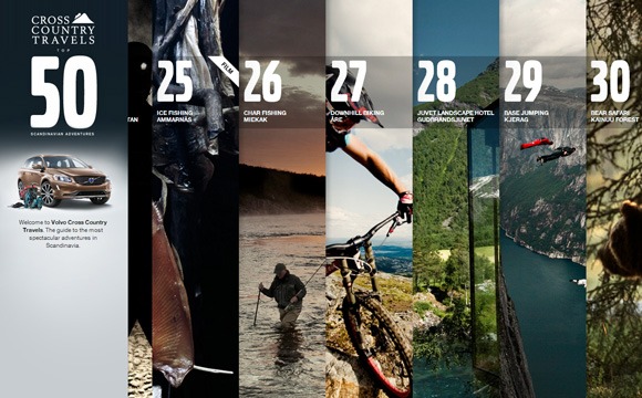
Mazda A to BT-50
A journey based navigation utilising both video and beautiful imagery of the Mazda BT-50. Fantastically practical for its target audience. 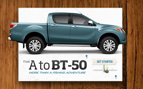
Dodge Dart Registry
Highly creative method for buying a new car. A lot of really cool functionality such as 360 degree view of the vehicle, graphical representation of funding progress, magnifying glass for car features to name a few. 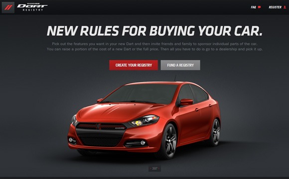
Hyundai Santa Fe Nouvelle Génération
The timeline menu on the homepage is a great example of attention to detail in execution. While the multi layer menu demonstrates good use of prime screen real-estate (above the fold). 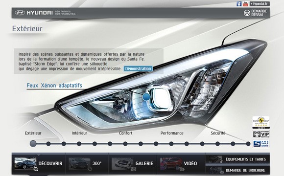
Jeep
Another very good example of standard navigation and great use of product photography. This website has a gigantic amount of content and the navigation is obviously well thought out and beautifully implemented. 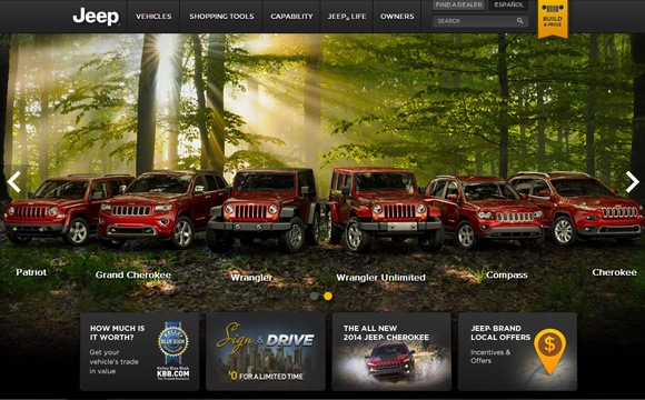
New 2013 Lexus LS
Hands down, most likely the best use of parallax scrolling car related website currently. Perfect use of simple animations, seamless transitions and sleek imagery. 
Peugot
Consistent with the Peugot’s tagline “Motion & Emotion”, the website has quite a different approach to an automotive brand. There’s no overwhelming fanciness here, just a brilliant creative. 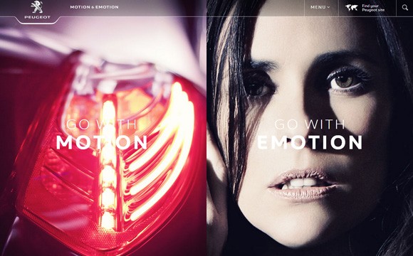
Volkswagen Summer
Very basic and clever usage of parallax scrolling right here. There’s no harm in abusing CSS3 effects when coupled with nice imagery. 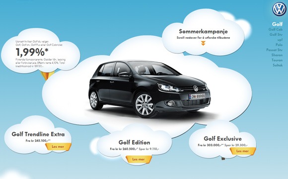
Mercedes – the new A Class
Parallax scrolling is definitely a huge trend in high-end web design right now, this creative was just waiting to be done – scrolling first person view from a driver’s seat. 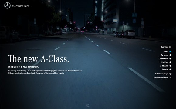
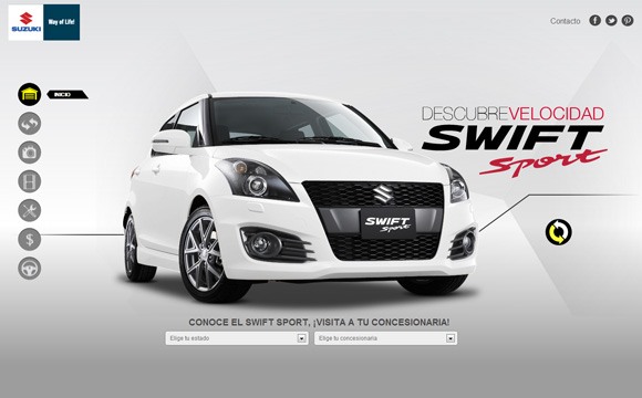
Suzuki Swift Sport
This single paged Spanish website uses a fanastic icon-based menu that navigates panning & scrolling pages. Nice use of gradients and shadows in conjunction with car photography.
 Cars Cars Cars!
I challenge you to find a current and better list of creative automotive & car websites on the internet! Leave a comment if you do find one, or drop a quick note on your favourite car related website. Also be sure to check out our other showcase of awesome uses of website typography from our blog.


