


07 Feb 25
7 Valentine Design Inspirations to Try on Your WordPress Website
Love is in the air, and so is the rush to find the perfect Valentine’s Day gift. Online shoppers are looking for inspiration and quick solutions. If your website isn’t optimized for the season, you could be missing out on valuable sales and engagement.
We know that we are only a few days away from Valentine’s, but a few strategic design tweaks can make all the difference. And the best way to do this is to draw ideas from designs that already work.
To get you started, we have listed 8 Valentine web design inspirations that you can try for your business’s WordPress site. Let’s start!
1) Godiva
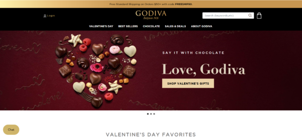
Luxury brands like Godiva know how to make a statement, and their Valentine’s Day designs always exude sophistication. The key takeaway? Use high-quality imagery, deep red and gold tones, and minimal yet bold typography to create an indulgent and high-end feel.
One stand-out aspect of their website is their CTA. It includes the phrase “Love, Godiva,’” which is a subtle yet effective way to mimic the affectionate closings of love letters.
Below the hero page, they highlight exclusive Valentine’s discounts alongside a curated chocolate box. Thus, this makes it easy for customers to find the perfect gift. This section is followed by their “Best Sellers” to ensure that shoppers can quickly access their most popular treats.
To implement this on a WordPress website, consider using a heartfelt CTA that adds a personal, romantic feel. Pair it with a well-structured homepage featuring a hero banner, a highlighted product section, and a best-sellers showcase to guide users seamlessly through their shopping journey.
2) Marks & Spencer
If you prefer a bold yet elegant Valentine’s aesthetic, consider taking inspiration from Marks & Spencer’s design approach. Their website blends rich reds with a minimalistic background that does not overpower the images and elements of each section.
To replicate this on WordPress, use deep reds and subtle accents to strike a balance between passion and warmth. Incorporating textured backgrounds and delicate typography can enhance the romantic appeal without overwhelming the layout. This approach works well for businesses selling gifts, home decor, fashion, or anything with sentimental value.
3) Nordstrom
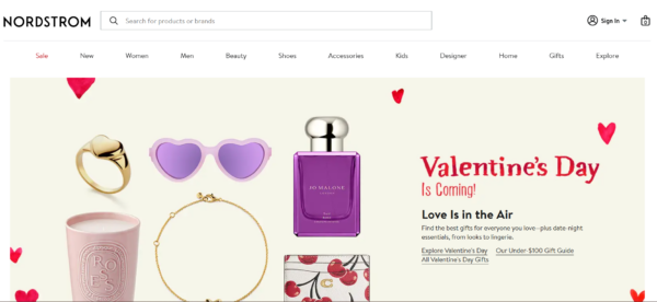
Nordstrom’s Valentine’s Day design is all about simplicity with impact. Large, high-quality images of curated gift ideas, bold call-to-action buttons, and less vibrant red accents make their campaigns stand out.
Businesses can leverage full-width images and high-contrast typography to command attention. Strong CTAs like “Shop Valentine’s Gifts” or “Find the Perfect Gift” should be clear and direct. If you have an eCommerce store, consider adding a countdown timer or, like what Nordstrom did, a simple statement like “Valentine’s Day is Coming” to create urgency and encourage purchases before the actual day.
4) Pandora
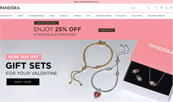
Pandora’s Valentine’s Day campaign features a slideshow hero section with two distinct messages. The first slide, “Love the Little Things,” evokes sentimentality, aligning with their charm bracelets and the idea of celebrating small, meaningful moments.
The website features a bold red and pink colour scheme, which aligns with classic Valentine’s Day imagery. The use of hearts, sparkles, and gift boxes reinforces the theme of love and celebration.
They also rely on high-quality close-up photography to showcase the intricate details of each piece. The clean, white background keeps the focus on the jewellery which enhances its luxury appeal.
5) Target
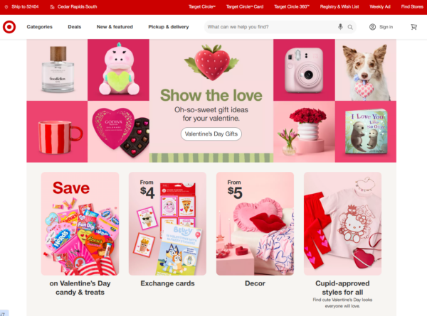
Target takes a fun and lighthearted approach to Valentine’s Day with cheerful colours, playful typography, and festive graphics. Their website features easy navigation and clear product categories to simplify shopping for Valentine’s.
Other business WordPress sites can replicate this by using bright pinks, animated heart elements, and bold, bubbly fonts. Adding a Valentine’s-themed banner and an interactive curated list of products can enhance engagement. This works particularly well for businesses that cater to families, kids, or casual shoppers.
6) Etsy
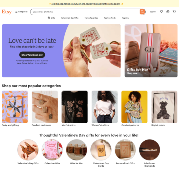
Etsy takes a different approach to Valentine’s Day website designs. Instead of the usual pink and red colour scheme, they focus more on messaging and their products.
They emphasised both convenience and personalisation in their web design approach. The hero section features the message “Love Can’t Be Late,” promoting gifts that ship in three days or less, catering to last-minute shoppers. This is accompanied by a ‘Gifts for Her’ banner, reinforcing the holiday’s gifting culture.
Below, curated sections showcase personalised gifts, trending deals, and budget-friendly finds, aligning with Etsy’s handcrafted and unique product offerings. The current website design effectively balances urgency with the platform’s signature artisanal charm.
7) Hallmark
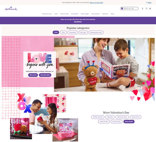
Hallmark focuses on highlighting nostalgic and feel-good designs that appeal to all ages. Similar to other web designs, it features a warm and romantic colour palette. Most of the dominant colours are shades of pink, red, and purple.
Overall, the homepage immediately sets the mood with heartfelt imagery of people exchanging gifts. In turn, this creates an emotional connection between the brand and its audience.
The phrase “Love begins with you” stands out in an artistic font. It reinforces the brand’s sentimental appeal combined with handwritten-style elements and playful graphics. Product discovery is seamless, with a layout that prioritises Valentine’s Day categories such as greeting cards, stuffed animals, and figurines.
Conclusion
Valentine’s Day is the perfect opportunity to refresh your WordPress website with festive and engaging design elements. Regardless of your ideal web design, these brand-inspired ideas provide various ways to enhance user experience and boost sales.
Need help developing and designing your WordPress site for Valentine’s Day and other seasonal events? Reach out to Chromatix today to boost your marketing efforts with a professionally built website.