15 Dec 22
Web Design Trends For 2023: 11+ Predictions & Observations
Technology and web design trends are forever changing and evolving, which means businesses and their marketing professionals need to stay vigilant. This is especially important if user engagement and experience are important. As user behaviours shift, websites that fail to keep up-to-date with the latest digital norms may ultimately see a drop in engagement or conversion rates if their website falls behind user expectations.
With a growing number of applications and new appliances joining the Internet of Things (currently around 9.7 billion devices in the mix), there are always new observations and predictions for web designers and marketers to stay on top of. This will help them stay one step ahead and create innovative designs that exceed user expectations and allow deeper connections.
1. A stronger push into conversion driven design
Businesses are realising the importance of tapping into the conversion-driven potential of their websites, with many more exploring conversion rate optimization (CRO) tools and techniques. Savvy businesses are using CRO strategies to increase their conversion rate well above the industry standard of 1.84%. It’s understood websites should not just be aesthetically pleasing but also serve practical purpose, such as educating, answering customer queries, addressing user frustrations and making it easy to buy.
Through CRO, all areas of the customer journey can be optimised to meet these needs, and ultimately increase conversion rates – from customer satisfaction to website usability. Crucially, with conversion-driven design, B2B companies are taking a more strategic CRO approach rather than just a good-looking website.
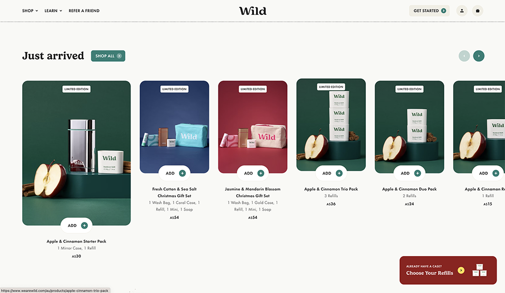
Source : Wild
2. Greater increase in accessible design
Web designers have been integrating more and more user-friendly elements, increased legibility and better contrast into their designs, allowing webpages to be better accessed by people with a variety of physical and cognitive abilities, ages, cultural backgrounds and locations. This is a great step forward when you consider that 62% of adults with a disability own a laptop or desktop computer.
With Google emphasising the importance of accessibility, there is a greater focus on providing quality web experiences for all types of users regardless of disability or age. We’ve seen more implementation of the accessibility widgets on websites that allow users to easily increase font size and dramatically change the contrast of colours.
Whilst innovative brands within the more creative sector will follow their own rules, this observation is particularly for more brands within the health, education and service industries that cater to a wider demographic.
3. Site speed takes priority
For many businesses, website speed is becoming the first priority, especially if ranking on Google is important. In addition, there is a growing number of impatient users who do not tolerate slow-loading times, and a slow experience will easily push them to the exit zone. In fact, 39% of users won’t even engage if a website takes too long to load. Once they’ve left, it is highly unlikely they will return. Having a website that loads quickly provides web visitors with the smoother and more seamless experience they desire and helps to keep them on the site longer.
Research continues to show that faster webpages result in higher user engagement, which is why web designers are prioritising fast loading times for optimal web performance. Now, more than ever, we see more simple web designs that load within 3 seconds. Whilst loading screens and lengthy transitions were all the rage for a while, they will languish on the back-burner as designers opt for more subtle effects that do not add to the burden of a heavy loading time.
4. Need for designers to learn sales skills
Increasingly, web designers are focusing on UX just as much as UI . With the rise of eCommerce, it is essential for web designers to also understand the basics of communicating well in order to inform and sell. This knowledge is critical when it comes to creating intuitive user flows and user journeys; particularly the transition from an educational experience to a selling one.
Good customer-centric web designers understand that their end goal should be an easy-to-use and user friendly interface that guides customers through their journey on the website, making it as effortless as possible for them to purchase what they need or want. When 60% of consumers rate usability as an important design characteristic for an online shop, function can no longer sit behind form.By having a great understanding of both web design as well as sales techniques, web designers can ensure they are weaving both elements together into a powerful marketing tool that encourages customers to navigate towards conversions.
5. AI driven images to supplement stock images
The surge of AI-driven technology has truly taken off and hit the mainstream market. AI-driven images are providing businesses with the perfect web design solution; not only are they able to curate custom imagery that is tailored to match their brand, but it’s also efficient and affordable. Traditional stock image, cannot beat the speed of Artificial Intelligence, nor the creativity or the degree of customisation.
Productivity has been taken up a notch with AI technology, allowing businesses to produce engaging visuals faster than ever before. For web design that needs unique images, AI is undeniably the most creative way to get them. The possibilities are truly endless.
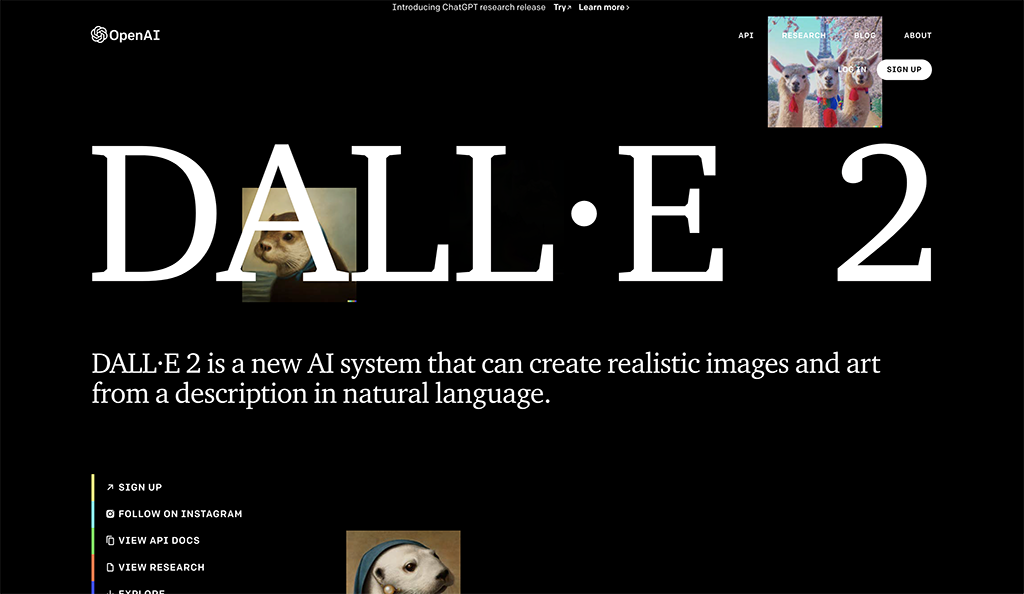
Source : DALLE2
Examples of AI Art technology
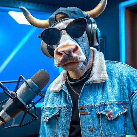
DALLE Generated Image of a “Hip hop cow in a denim jacket recording a hit single in the studio”
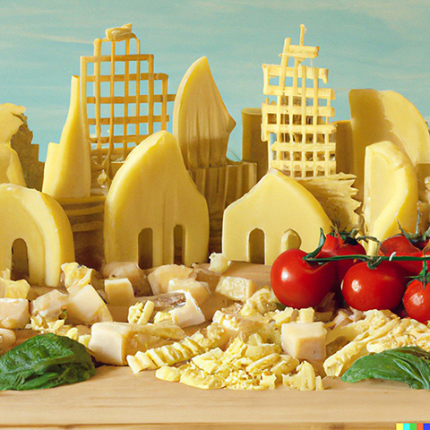
DALLE Generated Image of an “Italian town made of pasta, tomatoes, basil and parmesan”
6. Subtle micro-interactions & micro-transitions
Micro-interactions have become an integral part of web design, taking user engagement to a rich new level.
Barely discernible details such as pulses, hover states, colour transitions and loading effects – when put together – create a rich user experience.
Due to their small scope, they can be used in a variety of ways from subtle parallax effects, loading effects and larger, more playful animation. Smartly designed micro-interactions give web designs more life and engage users so that they stick around and explore longer. With users more intolerant of broken or bland web experiences, web designers understand how important it is to serve a dish with the final touches.
Parallax effects and animation serve as attention grabbers, helping capture the user’s interest while they explore a website. While little animation may not scream ‘Wow!’ like its bigger counterparts, it still serves an important purpose of keeping visitors engaged and can go a long way in terms of providing an enjoyable experience for those browsing your website.
7. Minimalism and going back to basics
Less is still more. Minimalism is a web design trend that has been around for quite some time and shows no signs of fading. At the moment, it’s one of the winning visual strategies for web developers who want to help companies make a bold statement with no unnecessary frills. The concept behind minimalism is simple: focus on creating particular focal points that give users clarity. This may be done with bold headings, crisp font sizes, or clean product photography. Minimalism creates an elegant final product and generates a level of sophistication and trust in a brand that can otherwise be difficult to convey.
Clean minimalistic design helps users focus, as there are less distractions.
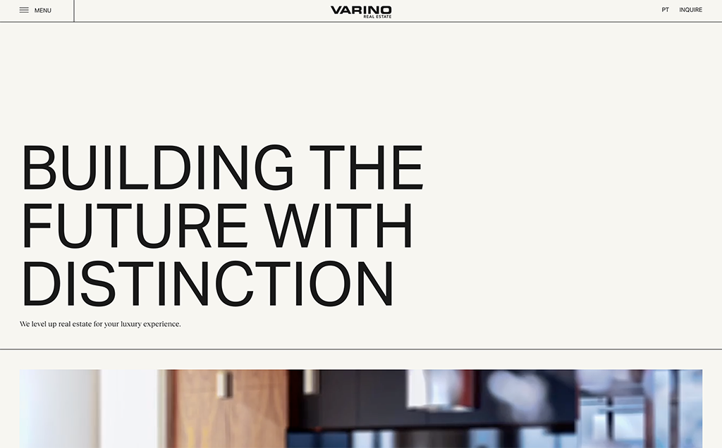
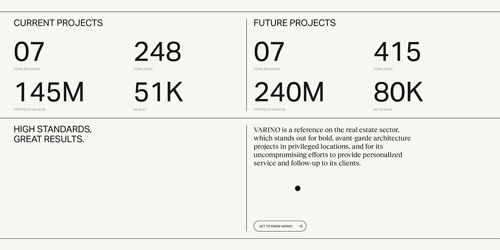
Source : Varino
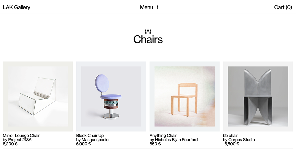
Source : Lak Gallery
8. Custom videography over stock videography
Video is a powerhouse tool for marketing and web design. The sustained no.1 ranking of YouTube for years and viral growth of Tik Tok are two reminders of the power of video. Its sustained influence suggests that businesses should seek to incorporate more custom video into their web design in order to ensure maximum possible returns from their social media marketing campaigns.
This year will see more businesses investing into custom videography, particularly with explainer videos and animation. It’s the essential step in creating a more personal and engaging brand experience.
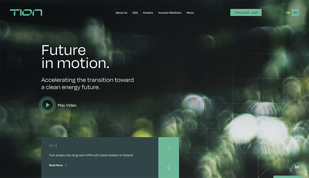
Source : Tion Renewables
9. Dark mode
The popularity of dark mode web designs is rapidly growing, and for good reason. It makes it easier on the eyes, which is becoming an increasingly larger concern due to the excessive amount of time we are now spending in front of digital screens.
With most older websites having whiter backgrounds, the contrasting black backgrounds creates an ultra-modern visual look. By darkening elements on webpages it allows designers to strategically highlight areas in a neon fashion, content and visual elements that they want users to interact with. This style is quite popular with innovative brands with a younger target audience, as they have to worry less about legibility of text or elements.
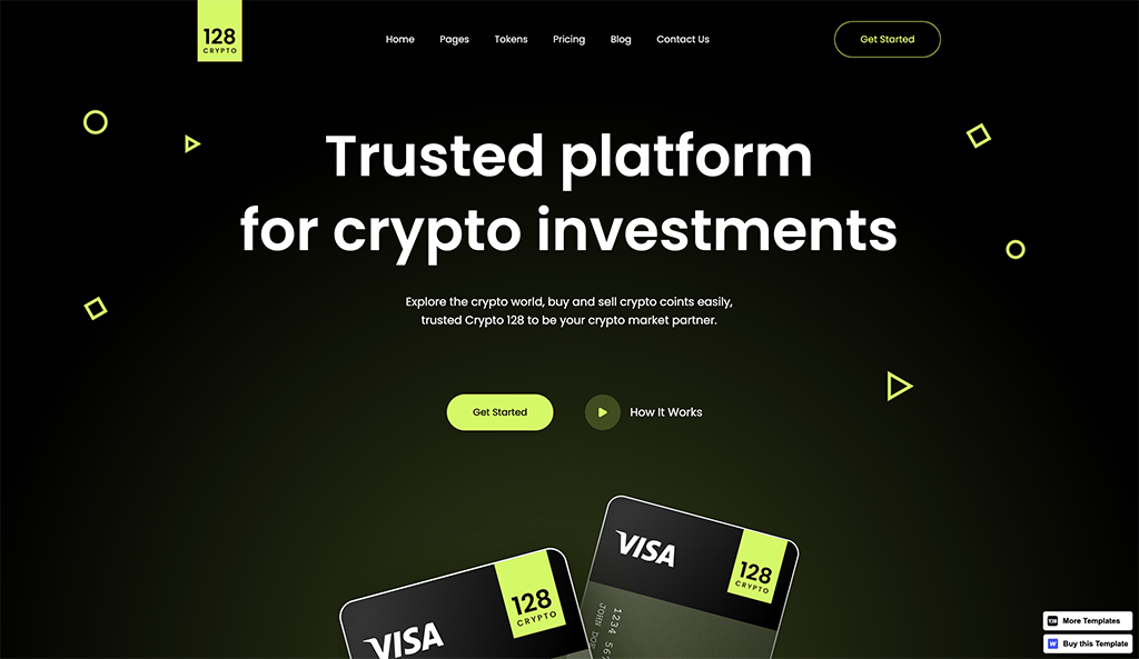
Source : 128 Crypto
10. Collage styling with illustration & photography
Brands are moving away from generic, stock photography and towards custom options to highlight their unique brand personality. What’s hot right now is the collage effect, a combination of unique illustrations with custom photography.
This approach creates imagery that feels more personal. If your competitors are still using stock imagery, opting for collage styling is one element that will make you stand out. There’s perceivably more effort involved, which can translate across to the added value in your services and products as well.
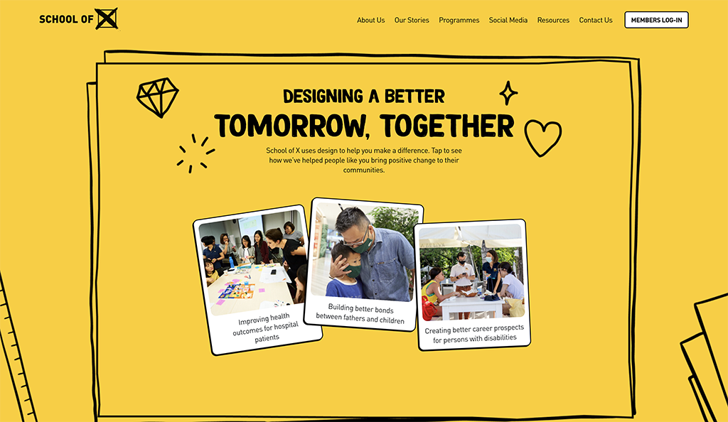
Source: School of X
11. Clean app style designs
As the divide between apps and website shrinks, the rise of clean, appy design in websites has been prolific. This style focuses on creating a simple, functional and intuitive experience. Appy design sees the priority being on interactive elements such as call-to-actions and profile avatars that look intuitive and a streamlined user journey. This web design style focuses on creating a functional and intuitive experience, as well as being easy on the eyes with elements such as profile avatars and call-to-actions.
It’s an effective way to link users along their journey and provides them with a user friendly experience, making it easier to find exactly what they are looking for.
12. Personable & persuasive copy
As more brands understand the power of words, they are prioritising the betterment of their web experiences. From conversational to personable copy, they are opting for storytelling style user journeys while utilising impactful language that better resonates with their target audiences.
With this new wave of copy taking over websites, a deeper connection between brand and consumer is formed; it’s as if dialogue has been opened up via the written word! This signifies a huge shift in how brands communicate with their viewers and is paving the way for an entirely new way of digital interaction.
Quick wrap-up
When it comes to web design, staying up to date with current trends is essential so that you can make the best decisions to stay relevant and continue connecting with your consumers.
Despite the vast and ever-evolving web of web design inspiration, you should never be afraid to explore your own creativity and look beyond the current trend: find what works for you, for your project and for good web experience overall.
Constantly shifting web design trends often provide ideas for web design styles and practices, but in the end, authenticity is key. Designing with true intent, rather than fixating on trends, will always ensure a good experience for users.
If you have found this article helpful, and would like professional help, feel free to reach out to our wonderful team of website designers and developers at Chromatix on 03 9912 6403. Whether you’re looking for a web designing and hosting company or developing and optimising, we would love to assist with your questions.


