26 Feb 13
Winning Website Oscars?
Congratulations to all the Oscar winners this year, but what does it take to win awards for Websites? Let’s start by examining some of the past winners from two of the most prestigious sources of web awards.  Many have tried to imitate, but the obvious Academy Award equivalents for websites in our opinion are:
- FWA (Favourite Website Awards) is an industry recognised internet award program established in 2000. FWA is the most visited website award program in the history of the internet.
- Awwwards has collaborated with some of the biggest names in the digital world. The Awwwards are highly recognised due to the multidisciplinary jury panel and strict criteria.
Current Trends
Looking at the screenshot below you will likely laugh, but FWA site of the year in 2000 was Look and Feel New Media. Back then Adobe Flash was cutting edge technology and being able to utilise vector animation creatively without compromising usability was a big deal. 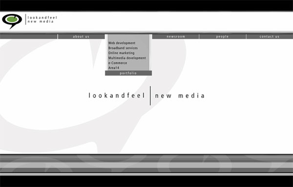 Fast forward a few years and FWA Sites of the year take Adobe Flash to a whole other level. Many of these Flash sites no longer exist largely due to the shift away from Flash for websites in the last few years, but some of them survived for us to reminisce at their past glory. Here are some of our favorite “Flash backs” (ha ha get it?):
- Starbreeze – FWA site of the year 2001
- Leo Burnett Canada – FWA site of the year 2005
- Get the Glass! – FWA site of the year 2007
Flash is by no means out of the picture though as there are still some fantastic Flash sites that are awarded on FWA, like “Only – The Liberation” – FWA Site of the month June 2012. However it’s hard to argue against the current HTML5, CSS3 technology trends, as the recent award winning sites often abuse and stretch the limit of these latest technologies. At times the award winning sites showcasing amazing new technology capabilities may win despite questionable usability and/or practical use (still deserving winners due to awesomeness of course), for example: 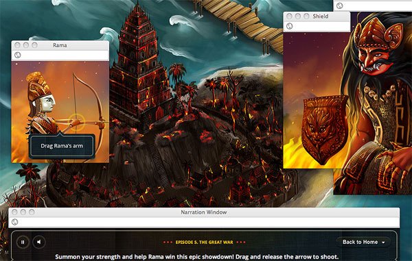
- Google Ramayana – FWA people’s choice award 2012
- The Expressive Web – awwwards site of the month May, 2012
- Jam with Chrome – awwwards site of the month Dec, 2012 / FWA site of the month Nov, 2012
Following current web design trends and culture via blogs and news undoubtedly helps, but why not keep track of winning trends by frequent visits to these two big sites.
Design & Creativity
Although both these terms are highly subjective and breaking down great design and creativity is another blog altogether, there some lessons can be learnt from the top recent winners.
- Simplistic effectiveness: CaptainDash – awwwards site of the month Jan, 2012
- Fresh Concepts: CNN – Ecosphere | COP17 – FWA site of the month Jan, 2012
- Clever use of content: Air Jordan 2012 – awwwards site of the month Mar, 2012
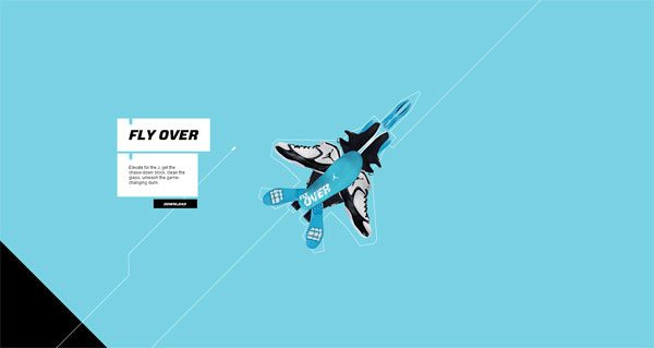 One of the most consistent features across winning websites is creative and non-standard navigation. Often the navigation is still intuitive and perfectly usable for the given content as well.
Usability & Content Delivery
At times there are winning sites with questionable usability and content like Sexy Fingers (slightly NSFW) – FWA site of the month Aug, 2011. In most cases though, despite funky design or ground-breaking creativity winning websites are highly in usability and deliver the content very effectively. Some of my favourites are below.
- Two minute teacher test – awwwards site of the month Apr, 2012
- The License Lab – awwwards site of the month Feb, 2012
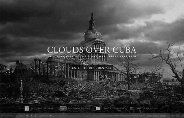
- Clouds over Cuba – FWA site of the month Oct, 2012
Games & Big Names
Most of us mere mortals can only dream, but having a big budget big brand Flash game or a big name client can most likely boost your chances of landing an award. Just browsing through FWA you’ll notice many recognisable brands, it’s no surprise since they likely have the biggest budgets for websites as well. Have fun with these games:
- Magnum Pleasure Hunt 2 – FWA site of the month May, 2012
- Finding Fantasyland – FWA site of the month Dec, 2012
- Bank Run Game – FWA site of the month Mar, 2010
Local Awards?
I’m sure there are many other design awards that are prestigious and well worth entering online and in your local area. For us in Australia there’s Melbourne Advertising & Design Club (MADC) Awards, Create Design Awards, Australian Web Industry Association’s (which we are a member of), Web Awards to name a few. Any other award sites worth mentioning? Any superb websites you think we should check out? Let us know below!


